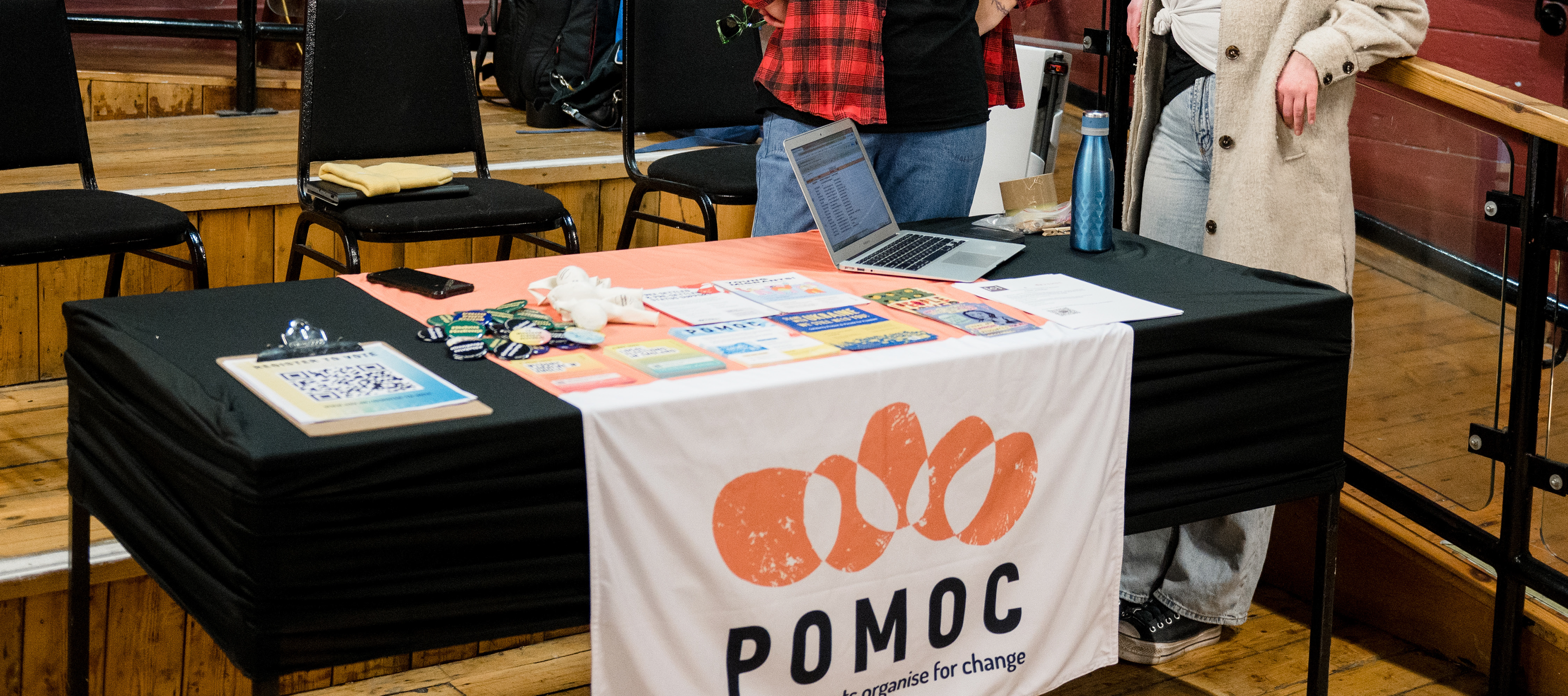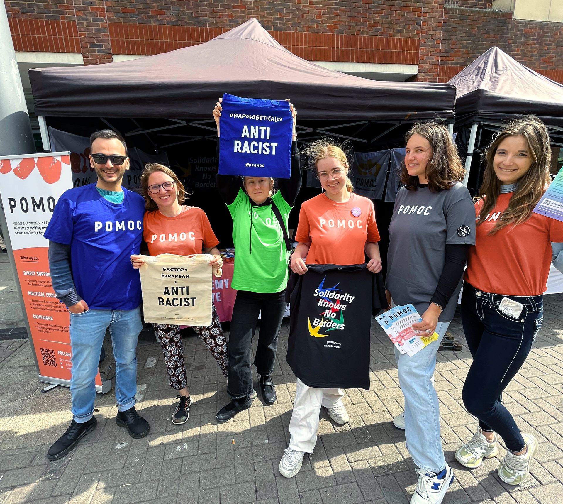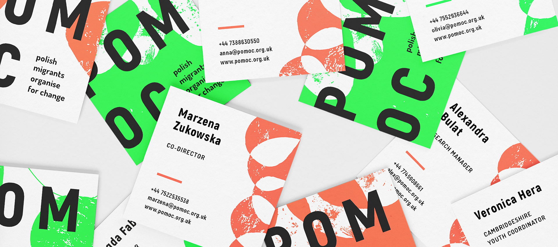
POMOC non-profit identity
Founded in 2020 by a Polish duo of artists and activists, POMOC is a migrants' rights non-profit whose work lies at the intersection of direct service political organising, and cultural events & programmes.
The name POMOC (pronounced po-mots) itself also carries several meanings. 'Pomoc' means help in Polish, 'moc' means power, and the acronym POMOC stands for Polish Migrants Organise For Change.
Intersectional community-building and empowerment are key pillars of the group's work and we wanted to reflect these themes in their visual identity via graphic elements including interconnected stones and a strong, vibrant colour palette.